SaaS Analytics Dashboard
Product-style dashboard UI focused on user metrics, subscriptions, and account activity.
- Role: UI Design
- Scope: Dashboard, tables, metrics, responsive layout
- Type: Conceptual product UI exploration
Context
Teams need a clear, at-a-glance view of key metrics and recent account activity to quickly understand product performance and spot issues without navigating multiple screens.
UI Focus
- Information hierarchy for data-heavy screens
- Scannability of metrics and tables
- Clear visual separation of primary vs secondary data
- Consistent spacing and alignment
Key Screens
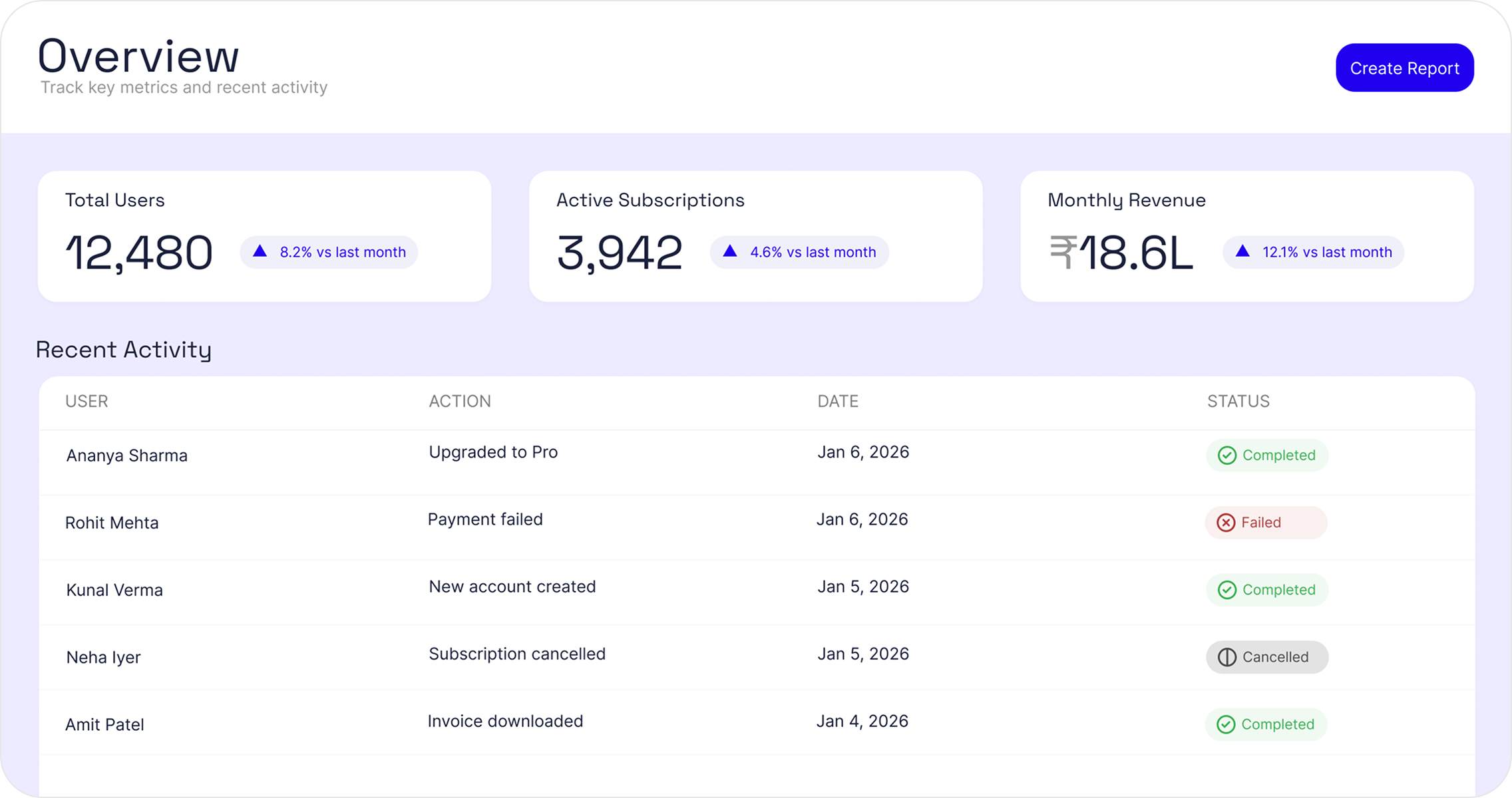
Dashboard Overview
Primary view showing key metrics and recent activity
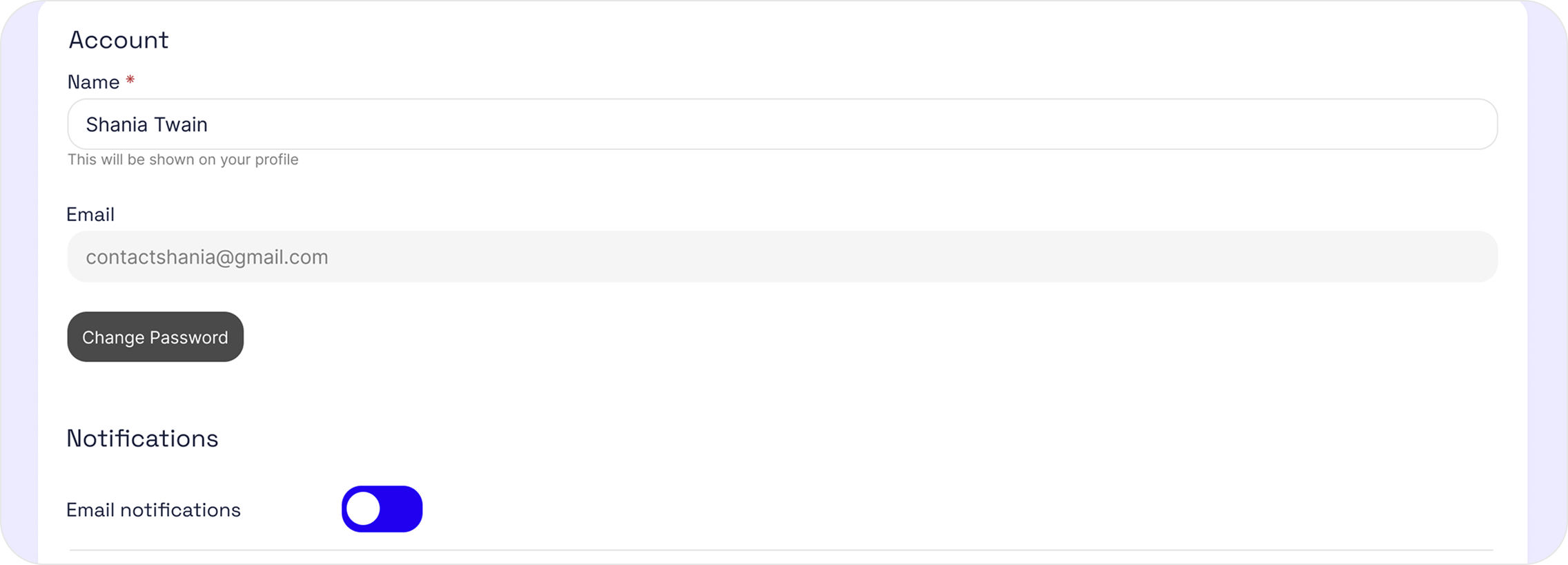
Account Settings
User profile and notification preferences
UI Decisions
- Prioritized at-a-glance metrics to surface product health without requiring navigation.
- Used clear separation between summary metrics and detailed activity to reduce cognitive load.
- Designed tables for scanability with consistent alignment, spacing, and status indicators.
- Kept interactions minimal to support frequent, repeat use.
Outcome
The result is a clean, production-ready analytics interface that balances clarity with information density. The dashboard enables users to quickly understand key metrics and recent activity, while supporting deeper inspection through structured tables and settings screens.